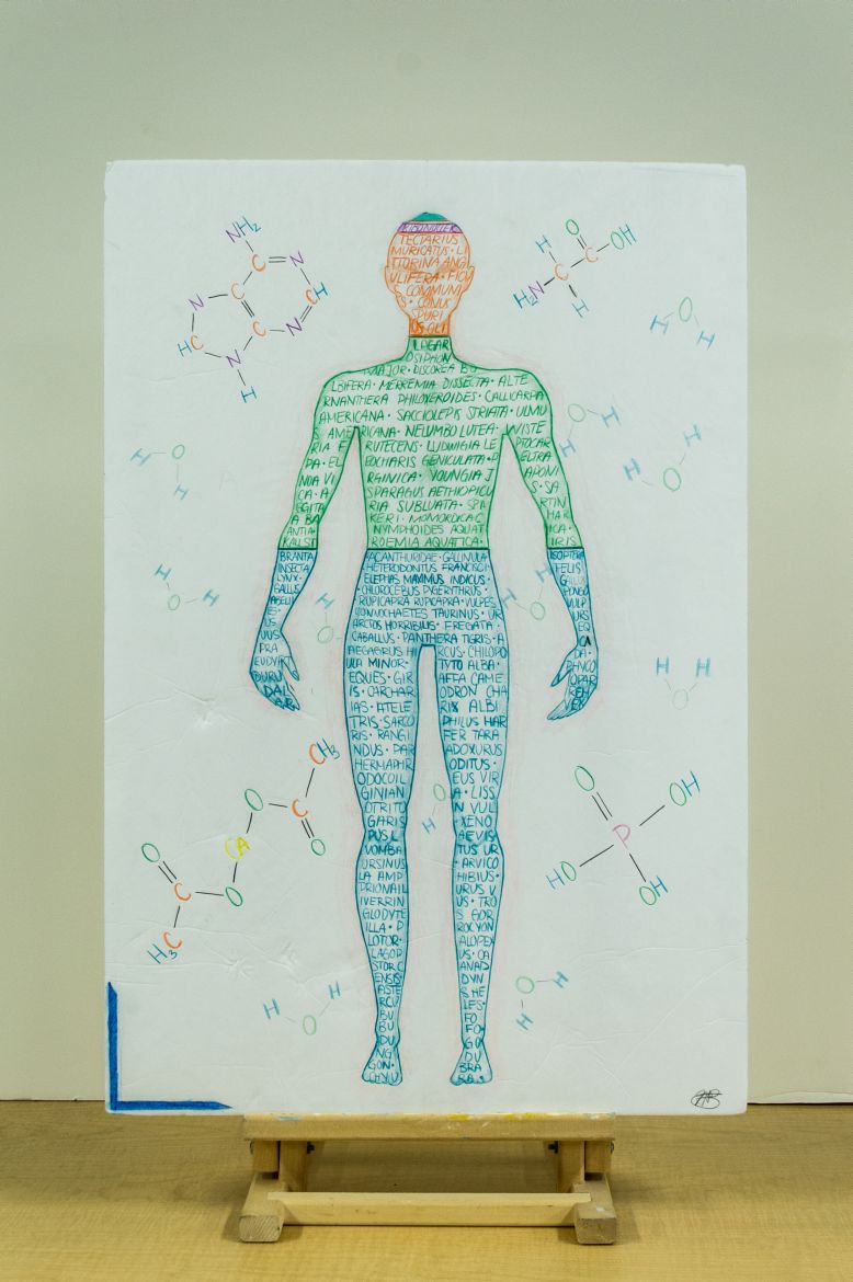


Almost three-quarters of the atoms that make up the universe are hydrogen atoms.1 Almost two-thirds of the atoms that make up the human body are hydrogen atoms.2 This is a great example of the interconnectivity of atomic composition, and demonstrates that we are all made of the same basic elements. These common components to everything that exists is what made me want to demonstrate that human beings are made of the same element as everything that surrounds us, such as animals or plants.
Matter being made of atoms is one of the most basic concepts that represent chemistry. It was also the basis of the project and the guiding idea throughout. This atomic composition of humans was depicted by the proportional division of the human body according to atomic percentage. The concept of periodicity within atoms was also represented within the artwork in the way that the molecules were formed: because of the periodic characteristics of certain elements, they always occupied the same place within the molecule: hydrogen, for example, was always on the outside of the molecule, regardless of what that molecule was. Furthermore, certain molecules had atoms that did not respect the octet rule, such as phosphorus for the PO3H4 molecule, which can be connected to the concept of larger atoms having more “d” empty orbitals they can fill to accommodate more bonds than usual (expand the octet). This can be seen in the molecules that are in the background. These molecules are bonded together because of the electrons that pair, which was easy to see thanks to the bonded elements in the background. The electrons themselves were not displayed, for aesthetic purposes, but it is still possible to infer the role of electrons in the bonding process. These chemical bonds are also what give each molecule their shape, which is visible in the background. Each molecule has a particular, determining shape, and while there are some similarities, it is easy to see that they are rather different amongst themselves, even though they all share the same basic purpose of making up the human body. These different shapes are contributing factors to the great diversity of life that is found in the universe. There are them residual forces that keep these molecules joined together so as to create condensed matter. Without these residual forces, it would not have been possible to draw the human body (DNA would not exist structured as we know it); it would have been an amalgam of molecules without any link between them. Furthermore, as is applicable to the whole universe, energy is conserved. Within the human body, there is always transformation of energy, be it from the food we ingest into lipids and energy, or from the molecules that break and create other molecules, releasing mechanical energy, there is a constant amount of energy.
Because of past artistic endeavours and a passion for the arts, there were more artistic choices than scientific ones in this project. The most obvious one is the choice of the main colours used: blue, green, orange, purple, yellow and turquoise. The colour blue was used to represent hydrogen because hydrogen makes up two-thirds of the water molecule, which is incidentally the same proportion it occupies in the human body (it is the main component, so it would be expected that the values for the average converge). It is used to write all the scientific names of animals that are also made of hydrogen. Green was used for plants for symbolic reasons, mostly because most people associate green with plants. Furthermore, plants produce oxygen, which was another reason that oxygen and plants went together to create the green part of the body. Orange was carbon because it was associated, for me, with fire because of carbon monoxide (and dioxide too?). It is also a colour that is more visible than the rest, so I thought it fitting it would go into the face part of the body. Purple and turquoise were picked because they fit in with the bright colour scheme, while also creating a contrast to the colours they were surrounded by. I tried to make each part of the body easily distinguishable from the others. As to the body itself, it is simply an outline of an average human body, with a few characteristics shaded in to add some realism. Because I did not want to write in black, it meant I had to keep the same colour throughout each body part, both for the writing and the shading. This means that the three-dimensional aspect of the body is not as apparent as it would otherwise be, as it would have rendered some words unreadable. I also lightly outlined the human body in a pink/beige colour to make it stand out from the background and to create a bigger contrast between the colours. The molecules in the background were kept very simple so as to not overwhelm the artwork: there would have been too much writing otherwise, as the body itself is made of writing. There are only the elements themselves, in the colour they are represented with in the body, and black lines to show the bonds. Black was chosen for the bonds to create a stark contrast to the rest of the artwork, and because bonds are a very important aspect of the composition of the body. Finally, there are paler water molecules all around the background to represent the omnipresence and importance of water within the human body. They are paler than the other molecules because I see them as being more of a basis for the body than the rest of the molecules, which are either vitamins or proteins.
References
1Nave, Carl. "Hydrogen-Helium Abundance." N.p., n.d. Web. 12 Dec. 2014. .